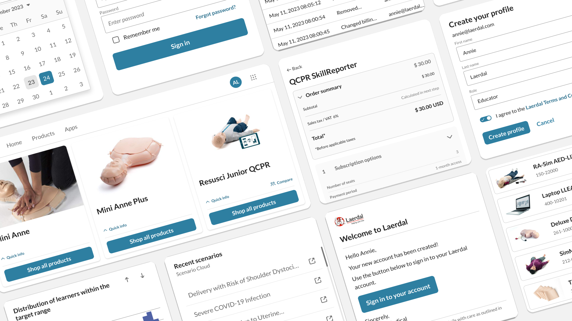
Establishing a design system for a growing portfolio of products
My client had the beginnings of a design system, but hadn’t yet started the process of using it across their product portfolio. I matured the system by adding a full set of core UI components, with proper documentation and UX writing guidelines, and coordinated the introduction of a React component library for all development teams.


As a lead product designer, I was involved on several projects at once. Having this oversight meant that I was able to influence the adoption of a consistent set of UI components and patterns.
I conducted frequent design reviews and engaged with accessibility experts to enhance the library and increase its core accessibility features, such as keyboard controls and ARIA labels.
Over the course of 12 months, I made other project teams aware of the benefits of using a ready-made component library. This led to 10 teams committing to use it for their own projects.