Fixing Cross-Site Navigation with Evidence and Iteration
Client
Laerdal Medical AS
Industry
Healthcare & Medical Technology
Role
UX Design Lead
Duration
6 months
Services
User Research, Usability Testing, UX Design, Prototyping
Impact Summary
- Direct success rate nearly doubled across core navigation tasks
- Average task completion time reduced by 48%
- 85% of users now find order history on first attempt (up from 70%)
- Cross-team alignment achieved through data-driven testing
The Problem
My client ran a digital ecosystem with three platforms built by separate teams: a product catalog, a user dashboard, and a customer account portal. Analytics showed that people were getting lost. User interviews confirmed it. Everyone knew it needed fixing, but full-time designers were stretched too thin to make progress.
Getting Teams on Board Early
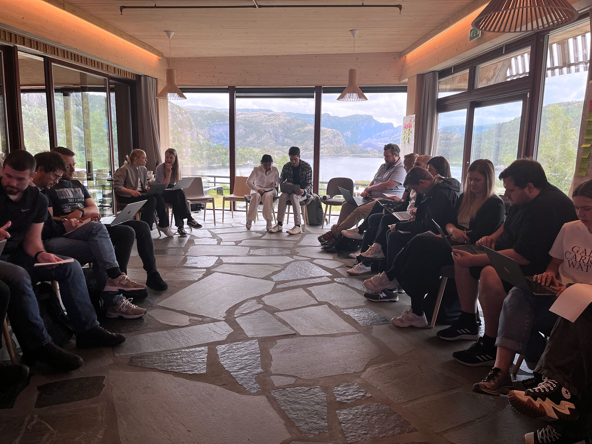
Before testing ideas with customers, I needed buy-in from the teams who’d eventually build this. At a company summit, I ran a workshop where 30 people worked in pairs testing a detailed prototype I’d built. Each pair completed realistic tasks like “find your order history” or “check your shopping cart.”
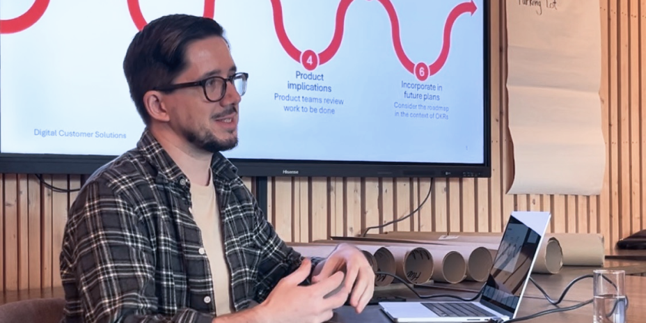

This wasn’t just research—it was alignment. By involving Product Owners, developers, and stakeholders early, they became invested in the solution. I gathered 15 sets of feedback in 20 minutes and turned potential resistors into collaborators.
Establishing a Baseline
To know if a new design actually improved things, I needed to measure the current experience first. Given the complex technical setup behind the main website, it was not possible to simply install a testing overlay. So instead, I recreated the existing navigation experience in Figma (including loading delays) and tested it with medical professionals using Maze.
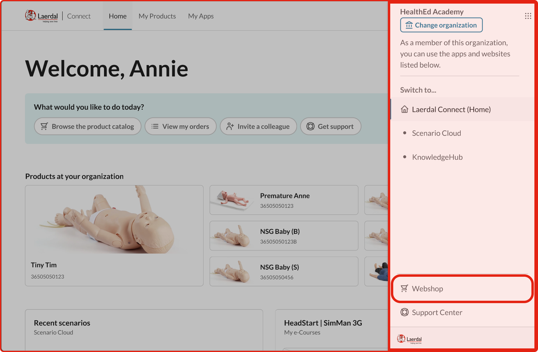
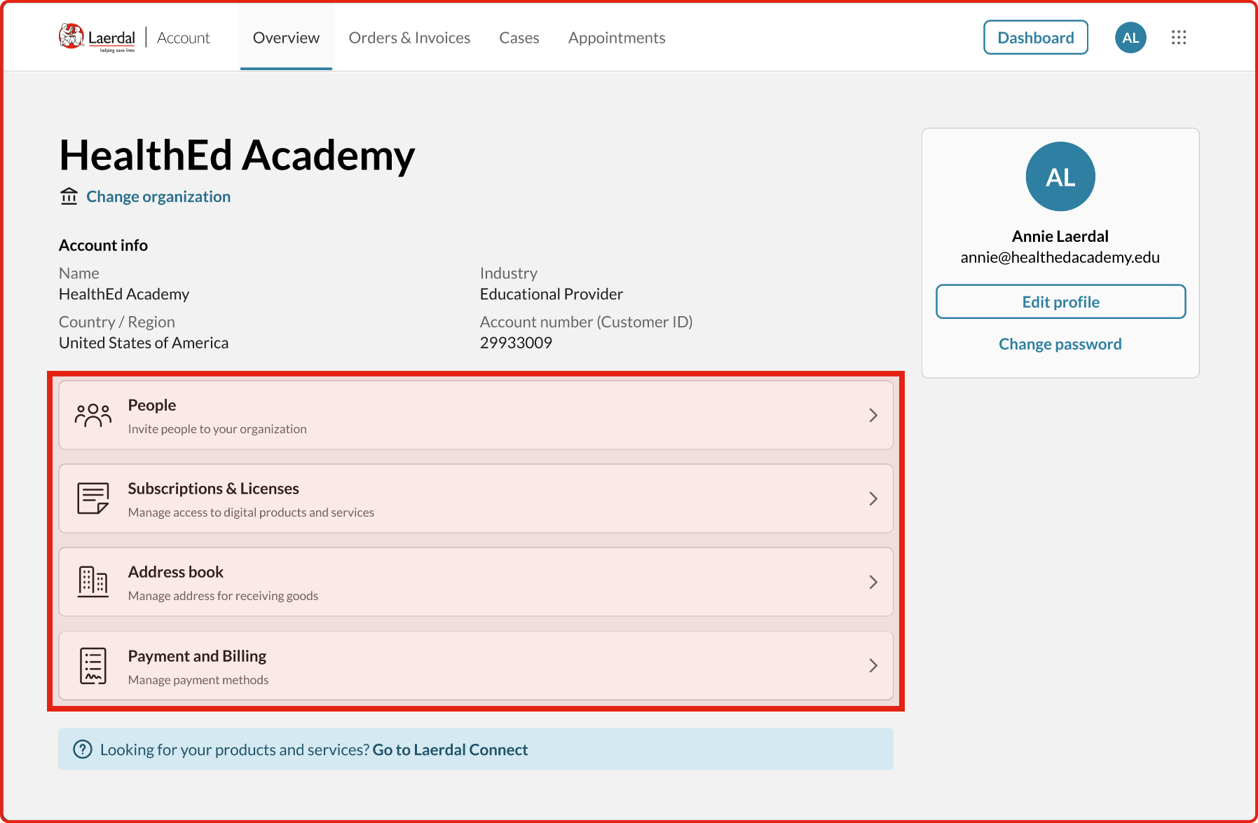
I wrote seven straightforward tasks such as “Sign in and go to your order history”, and “Check what’s in your shopping cart”. Simple scenarios that any customer might expect to encounter.
The results showed clear pain points:
- 42/100 overall usability score
- 3.7% direct success finding the shopping cart (most users gave up or clicked randomly)
- 29/100 score for locating products their company owned
- User comments described confusion and “random clicking”
Testing the First Concept
With another group of medical professionals, I ran the exact same seven tasks using the same concept prototype I’d earlier shared with the development teams.
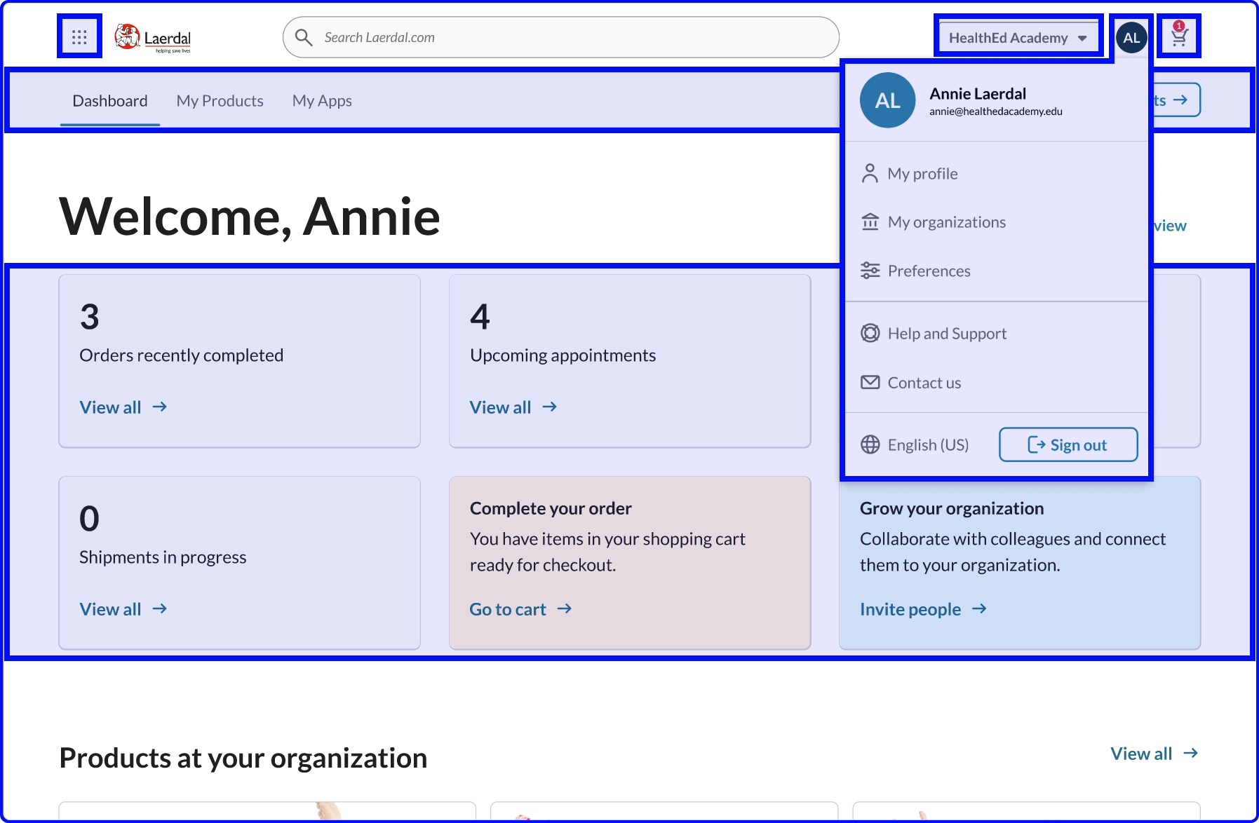
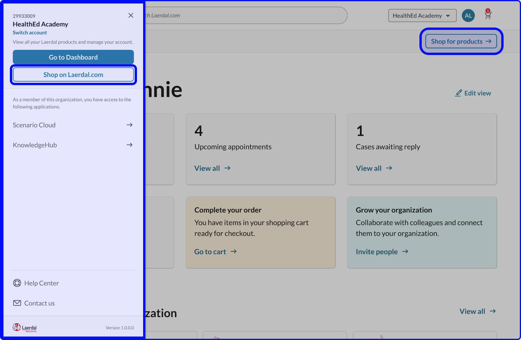
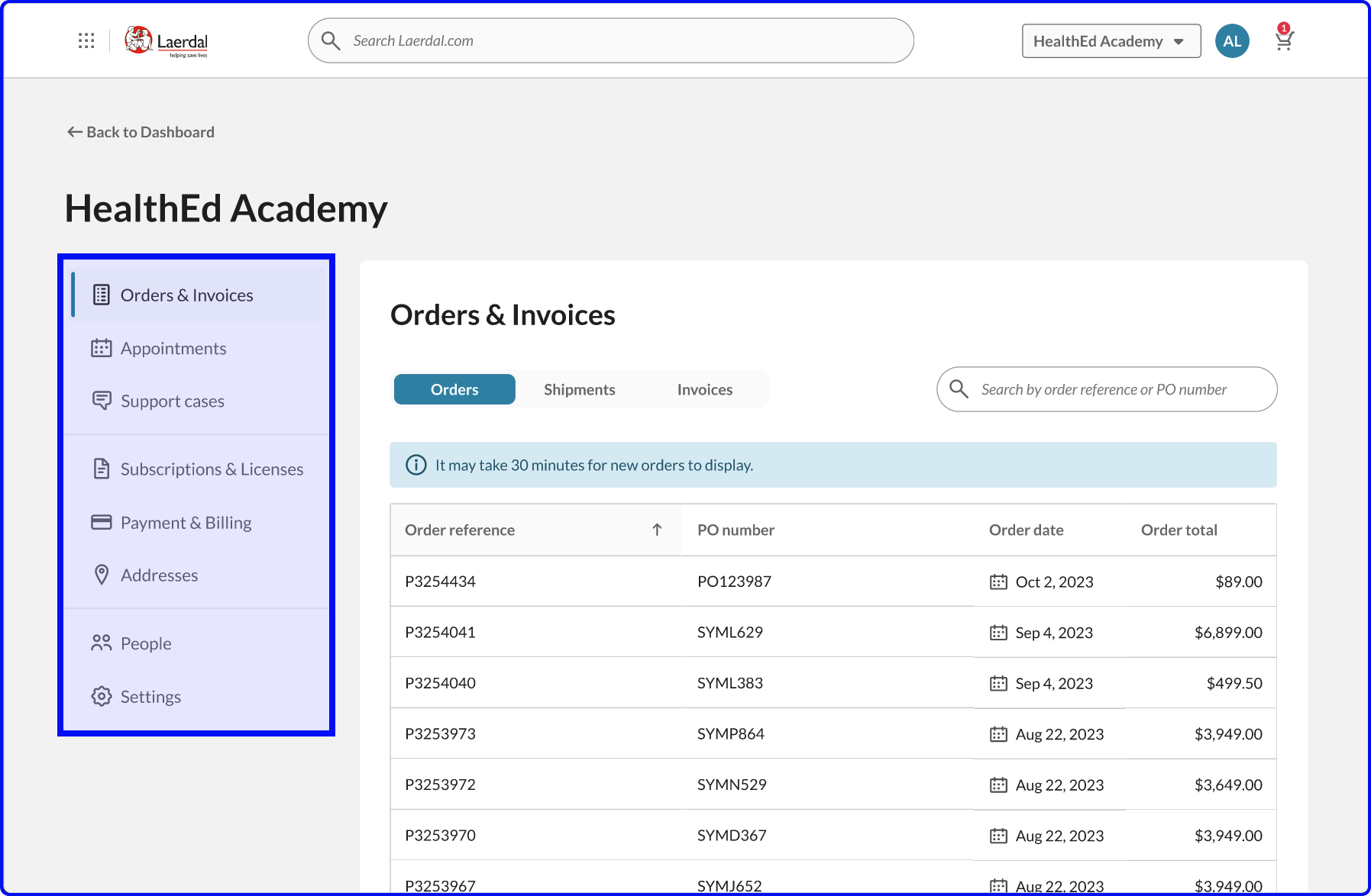
The improvement was immediate:
- 51/100 overall (+21% improvement)
- 95.2% direct success on shopping cart (simply adding a persistent cart icon solved the problem)
- 28.6% direct success on finding owned products (up from 3.7%)
But not everything worked. Invoice findability actually dropped from 59/100 to 37/100. This told me where my assumptions were wrong and what needed rethinking.
Iterating Based on What Failed
For the second concept test, I focused on addressing what the data revealed and made three focused changes:
-
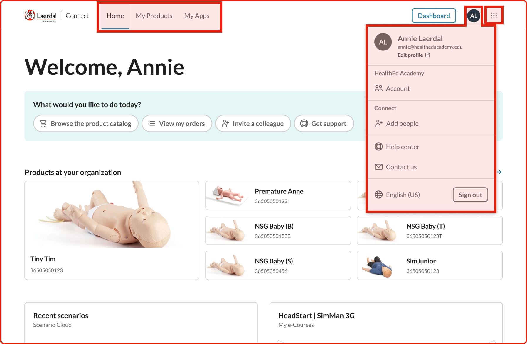
Consolidated the menus
Users found separate ‘Profile’ and ‘Account’ menus confusing—they couldn’t remember which held what. I merged them into one streamlined menu focused on the most common tasks. -
Added a Dashboard button
People kept getting lost and needed a reliable way to get back to a known starting point. The Dashboard button became that anchor. -
Made Help visible
Support options were buried in menus where users couldn’t find them. I added a dedicated Help icon to the main navigation bar.
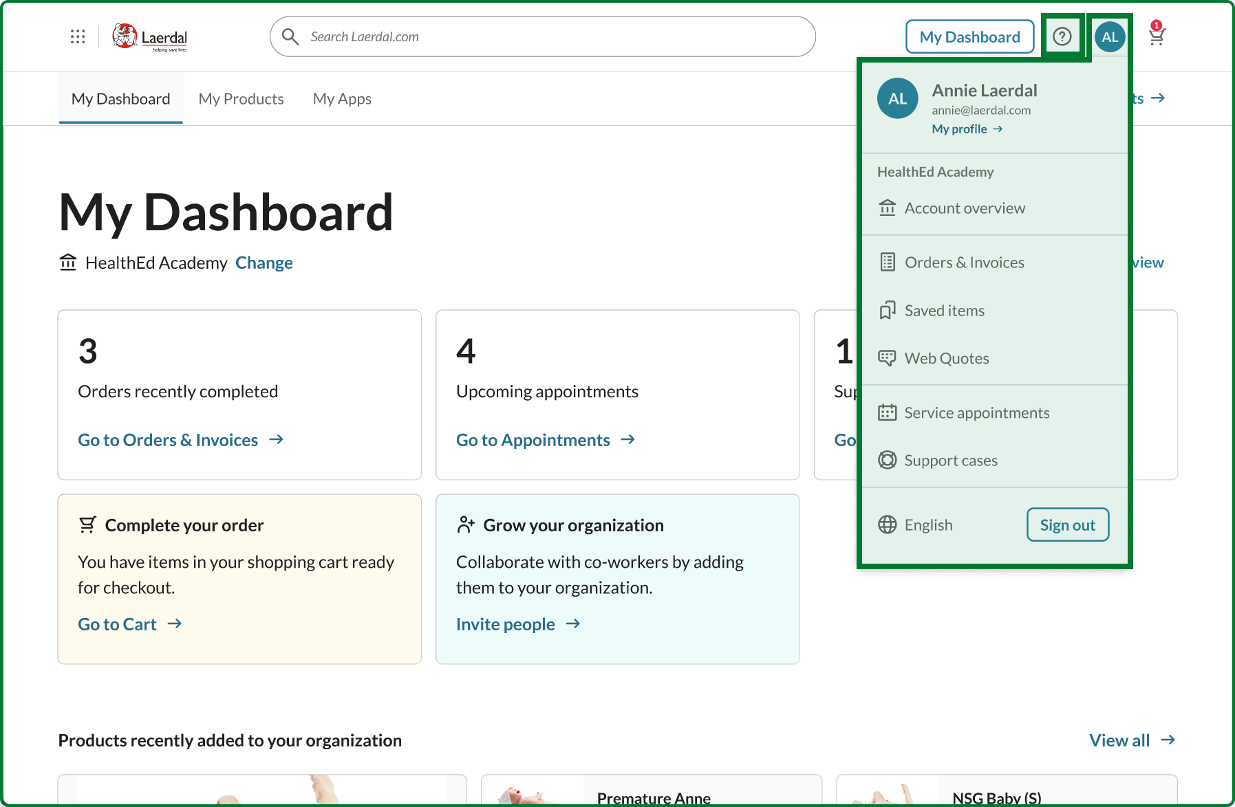
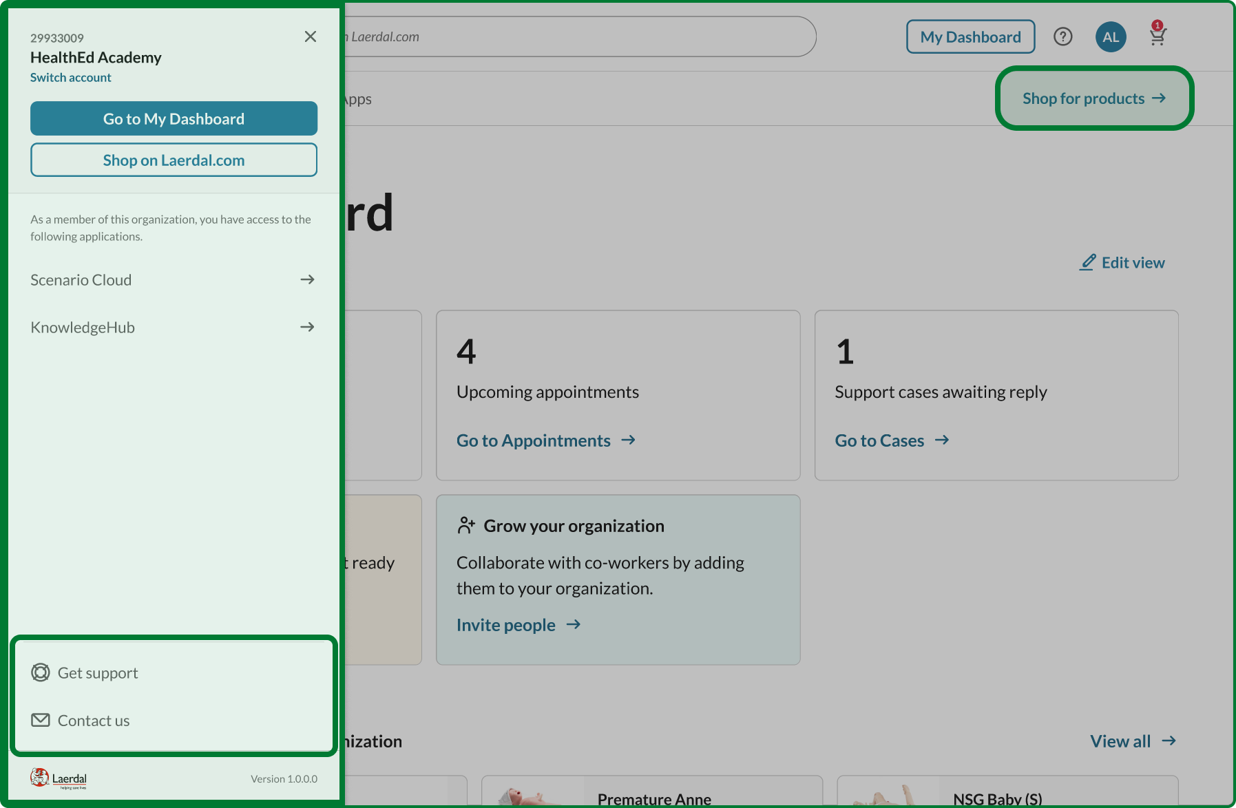
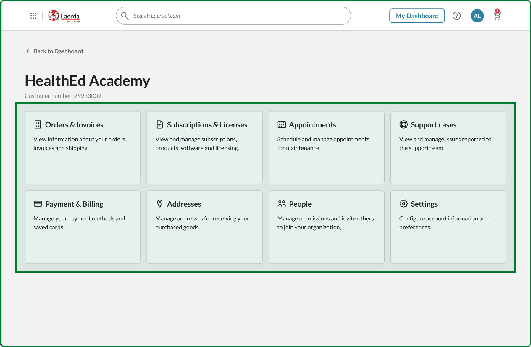
Testing these iterations showed howthe changes worked:
- 59/100 overall (+40% from baseline)
- 60/100 for shop access (up from 39/100)
- 49/100 for subscriptions (up from 20/100)
- 60/100 for invoices (recovered to baseline)
The data also revealed issues outside my control. Another team had redesigned the support page to prioritize self-service, but testing showed this decreased usability from 41/100 to 27/100. When I shared this evidence, we had a productive conversation about balancing business goals with user needs.
From Testing to Implementation
I presented the results to all teams. When the data shows this level of improvement across core tasks, there’s little room for subjective debate. The evidence created alignment.
I translated the validated design into development stories—specific Jira tickets with clear acceptance criteria and documented technical constraints. Several are now in development, with the new navigation launching in early 2025.
Solving the Technical Challenge
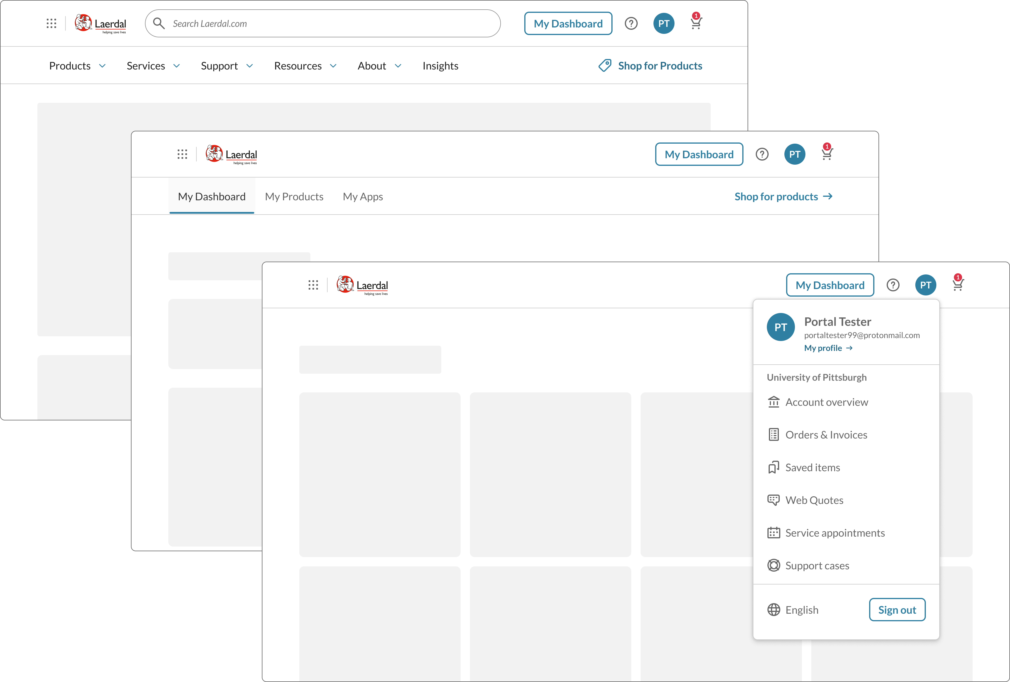
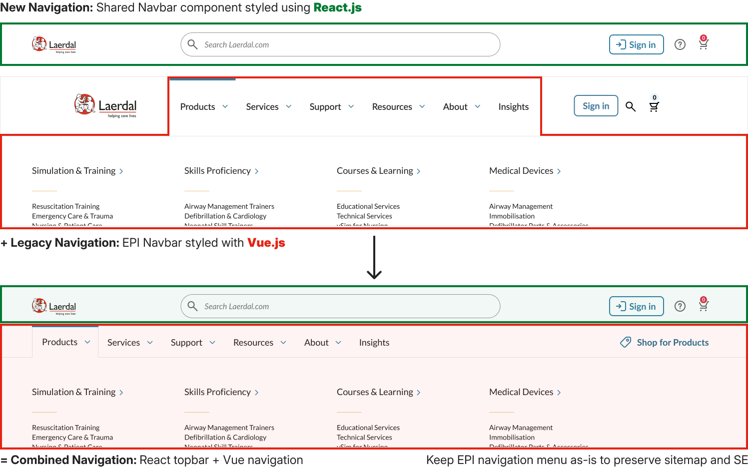
The design was validated, but implementation hit a wall. The main ecommerce site ran VueJS while everything else used React. The ecommerce team couldn’t migrate their codebase, which meant the React component library couldn’t be used where it was needed most.
I proposed building a React topbar that would sit above the Vue application—position-fixed at the top, rendering independently. Not architecturally ideal, but pragmatic. It let us use the component library that already existed while respecting the constraints the ecommerce team was working under.
This unblocked the entire project.
What made this work
Taking ownership.
When a known problem had no owner, I stepped up and drove it through to launch.
Using evidence to guide decisions.
Two rounds of testing with 75+ participants eliminated guesswork and built consensus across teams.
Solving pragmatically.
The React topbar wasn’t perfect, but it got us shipping real improvement to customers.
Moving quickly.
From years of inaction to validated design and implementation in months.