From Fragmented Components to a Unified Design System
Client
Laerdal Medical AS
Industry
Healthcare & Medical Technology
Role
Product & UX Design Lead
Duration
3 years (plus ongoing support)
Services
Design Systems, Component Design, Developer Collaboration, Team Mentorship
Impact Summary
- 80% component adoption across active projects
- 15+ projects using the React library within two years
- Zero frontend specialists required for quality implementation
- Unified modal patterns replaced dozens of inconsistent variations
The Fragmentation Problem
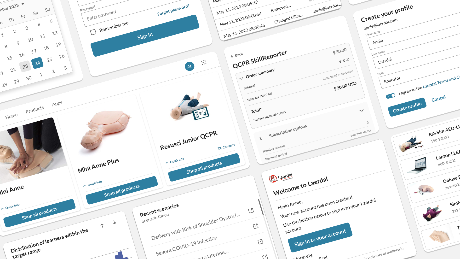
At the start of my engagement with Laerdal, their design system existed in theory but not yet in practice. Teams across the company were still building their own isolated component libraries, with each project reinventing buttons, cards, and modal components in slightly different ways.
The core issue wasn’t lack of design documentation. It was that most projects used React, but no shared React implementation existed. Backend developers (Laerdal had no frontend specialists) were left interpreting Figma files and building components from scratch. As designs evolved, these isolated implementations fell further out of sync.
I saw teams duplicating the same work over and over while the central design system remained underused.
Setting Standards
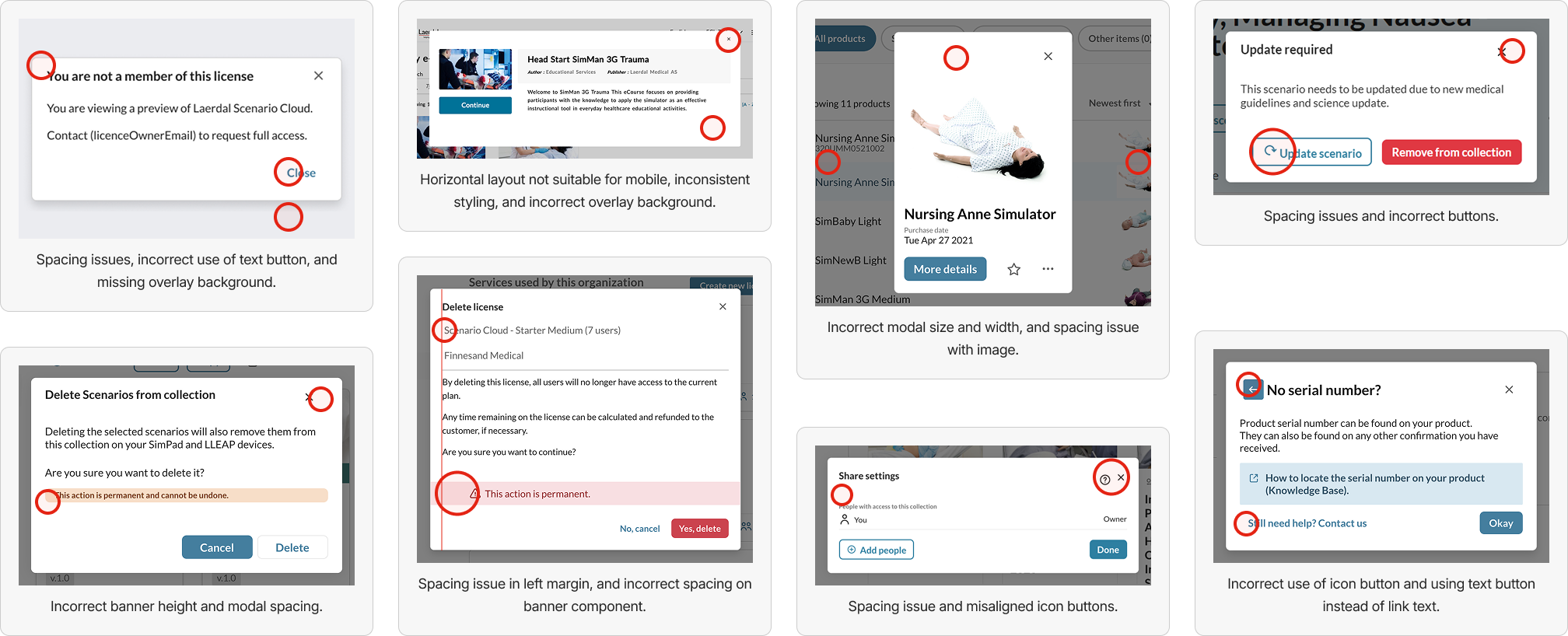
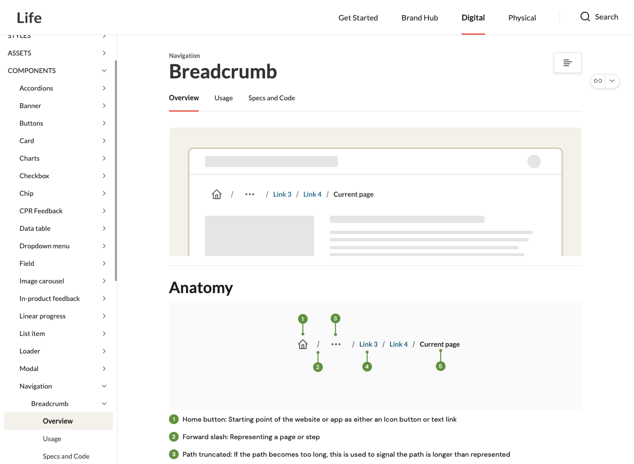
One clear example: modal components.
When I arrived, I counted dozens of different modal implementations across projects. I noted issues like buttons positioned differently, varied styles, and inconsistent interactions for opening and closing.
I proposed consolidating these into two core patterns:
- Dialog modals for messages, feedback, and instructions
- Content modals for displaying tables, images, and file previews
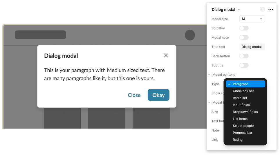
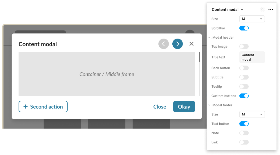
These two patterns covered 90% of use cases whilst eliminating the inconsistency that confused users moving between products. Teams stopped building custom modals and started using the library versions.
This became the template for how we expanded the system: identify the pattern needed across projects, design one flexible solution, implement it in React, and make it easy to adopt.
Seizing the Opportunity
One summer, during a quiet period of work, I saw a chance to partner with two senior developers to kickstart a React component library. In a few short weeks, we pulled components from various projects into a unified structure using Storybook.
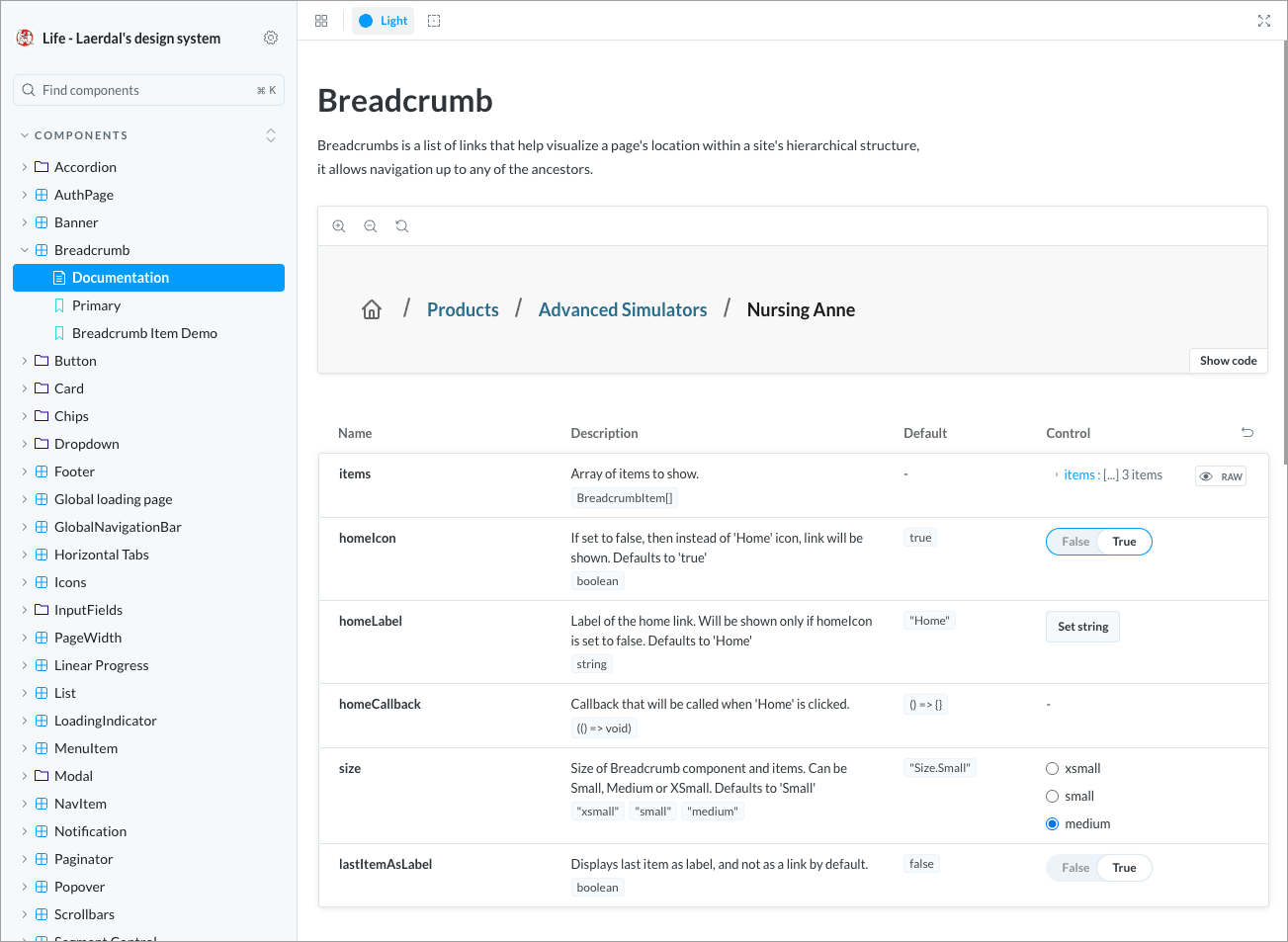
This wasn’t about building everything from scratch. It was about gathering what already worked, standardising it, and making it accessible.
But getting it built was only half the battle. We needed teams to actually adopt it.
Making the Case to Teams
I led the evangelisation effort along with a couple of senior developers. We ran demos for the project teams in our office, showing how the library would save them time and improve quality. We gathered testimonials from early adopters who’d already experienced the benefits.
The pitch was simple: backend developers without frontend expertise could now implement designs that matched the Figma components with 99% accuracy. No more guessing at sizing, colours, or interaction patterns.
This resonated because the reality was that Laerdal designers rarely had capacity to QA every implementation detail. The library meant quality by default rather than quality by constant oversight.
Building for Longevity
As the system grew, I took responsibility for quality control. I QA’d every component that entered the library, created and prioritised tasks for improvements, and wrote guidelines that even junior designers could follow.
I also added technical documentation that developers needed, such as z-index elevation rules and ARIA labels for accessibility. The system wasn’t just visual specs; it was a complete implementation guide.
Over time, we expanded from basic components to cover the everyday needs of nearly every project. The library became stable enough to work across different contexts and device sizes, which built trust with teams.
The Reality of Adoption
Not every team came on board. The main website, a 20-year-old legacy platform, could not be migrated to React. Their codebase was patched together from multiple technologies, and modernisation wasn’t feasible in the short term.
One team reported challenges with customisation and contribution processes. As one senior developer noted: “We had some small issues related to not being able to customise certain components and not finding an easy way to contribute to the library ourselves.”
But the fundamental value was clear. A tech lead from a long-term adopter project put it simply: “We have been using the UI library for years now with great success. We feel the solution is mature and well supported and changing implementation would be prohibitively expensive.”
The fact that switching away had become ‘expensive’ showed that the library had evolved into essential infrastructure.
What made this work
Speed to value.
We didn’t wait for perfect conditions or complete buy-in. We built
something useful quickly and let the results speak for themselves.
Solving real pain.
Every component we added addressed actual problems teams were
facing, like the modal inconsistency.
Making implementation easy.
Backend developers could ship quality frontend work
without specialised skills.
Quality by default.
The library maintained 99% accuracy to Figma, which built designer
trust and reduced QA overhead.
Ongoing evangelisation.
Adoption didn’t happen automatically. We continuously
demonstrated value and gathered advocates.
Within two years, the library became the foundation for 15+ active projects. Teams that adopted it shipped faster and more consistently. The design system went from “nice-to-have” to essential infrastructure.